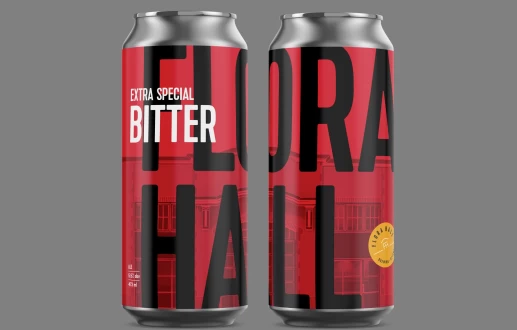
iA


Blog

Using Twitter to Better Understand and Strengthen Your Brand
Social media services like Twitter, Facebook and Google+ can provide companies with insight into how their brand is viewed. These services provide opportunities for interaction, to strengthen customer relationships, and can be used to research your business space. Read more – ‘Using Twitter to Better Understand and Strengthen Your Brand’.
Cudazi Logo and Brand Identity
Cudazi is Curt Ziegler, a WordPress theme developer specializing in clean, modern, and simple web site design. The goal was to capture this passion for minimalism in every as best of the branding. The logo based on the concept of a site map, symbolizes growth, structure, and purpose. Read more – ‘Cudazi Logo and Brand Identity’.
Deliverables for Coredge Software Branding
Below is a comprehensive list of the materials developed for Coredge Software. Corporate logo Product naming Product logo Tagline Letterhead Envelopes Business cards Kitfolder Website (previous version no longer online) Thankyou cards Christmas cards Fact sheets User interface icons Software packaging Trade show exhibit Print advertising Banner ads Powerpoint template Shirts Read more – ‘Deliverables for Coredge Software Branding’.
Logo Design and the Misconceptions of Unlimited Choice
Choice can provide an illusion of security, a false guarantee that quantity will result in something good. The reality is that more crap results in a bigger pile of crap—it doesn’t make it better. Successful brand design relies on understanding, strategy and hard work. Design services that offer unlimited logo designs and revisions also offer very limited understanding and strategic value. Read more – ‘Logo Design and the Misconceptions of Unlimited Choice’.
10 Tips to Avoid Logo Regret
Like rushing headlong into tattooing your lower back during a drunken stooper, fast tracking and penny pinching a logo will leave you with a painful and expensive reminder of a bad decision. Slowly, the full effect of your uninformed choices will come to light. The work might have been done by a relative, a “desktop [...] Read more – ‘10 Tips to Avoid Logo Regret’.
The Muni Logo Rolls With the Times
On a recent trip to San Francisco, the identity that connected most with me, was the logo for Muni. It’s a great example of how standing by a well designed logo rather than ‘keeping up with the times’ can sometimes provide a deep feeling of authenticity. The identity feels real, lived in and stylish to [...] Read more – ‘The Muni Logo Rolls With the Times’.
$20 Logos. You Know They Can’t be Real Right?
I discovered a new website this week offering customers unlimited logo designs for $20. What do their customers expect in return for the price of a movie ticket? Do they really believe they are getting a custom identity? Thinking $20 pays for enough of a graphic designer time to create anything worthwhile is like believing [...] Read more – ‘$20 Logos. You Know They Can’t be Real Right?’.
It’s Always Been the Colonel (How Logos Acquire Meaning)
The most common example of hidden imagery in a logo is likely FedEx and it’s arrow. For me however, it isn’t what first comes to mind. As a child I saw something in the Kentucky Fried Chicken logo that I can’t help continue to see to this day. Read more – ‘It’s Always Been the Colonel (How Logos Acquire Meaning)’.
Logo Warehouses, Crowdsourcing, and a Lack of Understanding
Logo design should not be approached with the goal of filling that blank spot on the top of your letterhead. It is not the time to recklessly do something trendy and cool. Most importantly, it is not about getting a task off your to-do list so you can move on to selling widgets to your [...] Read more – ‘Logo Warehouses, Crowdsourcing, and a Lack of Understanding’.
Winners for Logo Nest Book Giveaway
This was the first idApostle giveaway, and had over 300 entries. The winners of the two copies of the Logo Nest book are: Lindie Stauder and Aaron Pin Once I sort out your mailing addresses (please contact me), I will send off the books. I hope you enjoy them. Thanks to everyone that entered—there will be [...] Read more – ‘Winners for Logo Nest Book Giveaway’.
idApostle Logos Selected for LogoLounge Typography and Enclosures Book
Following publication of  idApostle logos in three new design books, I am very happy that LogoLounge has selected the Stealth Security and Ricochet Creative Thinking logos for their upcoming book, Master Series: Typography and Enclosures. This is the third LogoLounge publication to include idApostle work. Previous logos selected for the series were TaraSpan, idApostle, Processed Identity [...] Read more – ‘idApostle Logos Selected for LogoLounge Typography and Enclosures Book’.
Adobe, Does CS Stand For Crowdsourcing?
Is Adobe Crowdsourcing a New Logo? The competition is being run by Adobe Creative Juices, a community ‘powered by Adobe’ aimed at a UK and Irish creative community. Designers are being asked to design the new Creative Juices logo with the winning entry receiving an Adobe CS5 product. In return, they promise that the winning logo [...] Read more – ‘Adobe, Does CS Stand For Crowdsourcing?’.
Logo Nest Book Giveaway
I am thrilled to have contributed the article The Role of Sketching in the Creative Process to Logo Nest 01. The newly released book is now shipping and I am giving away two copies of the limited edition run. Logo Nest: The Book From Logo Designers For Logo Designers At 192 pages, the hard cover book includes [...] Read more – ‘Logo Nest Book Giveaway’.
Logos Before Words
It is incredible just how many cropped logos adults can recognize in only black and white. It is even more incredible to see reports like: New Study Finds Children Too Young to Read Recognize and Understand Corporate Logos. The study finds that “Kids … are using brands as indicators of popularity or success.” Hmmm, sounds [...] Read more – ‘Logos Before Words’.
Logo Design is Not Like Mr. Potato Head
For the past year I have been very active on Twitter but have completely ignored Facebook. Having recently seen that People Use Facebook 44% And Twitter 29% For Social Sharing, I have decided to take the leap and start using the service. I will be posting more frequently on Facebook than I do on this site [...] Read more – ‘Logo Design is Not Like Mr. Potato Head’.
Best Brand Related Links for February 2011
Here are a few logo, brand and graphic design related links I enjoyed this month: Authenticity Is King Because Branding Bores Everyone “People are willfully engaging with your brand, starting discussions about it of their own volition, and using it as a way to define who they are, by “liking” a brand on Facebook, or [...] Read more – ‘Best Brand Related Links for February 2011’.
idApostle Logos in Three New Design Books
Four idApostle logos appear in the recently published Logolicious!, Design DNA Logos, and LogoLounge 6 books. Logolicious! is “a tasty collection of the best logos from around the globe” and showcases the logo for Jennifer R. A. Campbell and the Westboro Nursery School. The volume focusses on “work with high-level thinking”, “representing a careful thought [...] Read more – ‘idApostle Logos in Three New Design Books’.
Designers Shouldn’t Be Taxi Drivers
The following is an excerpt from Creating the Perfect Design Brief, How to Manage Design for Strategic Advantage by Peter L. Phillips. “Over the years, I have traveled a great deal all over the world. When I arrive at the airport in a city, I have a business problem to be solved. I am at [...] Read more – ‘Designers Shouldn’t Be Taxi Drivers’.
HOW Magazine Selects idApostle for Top Ten List
Every month HOW magazine compiles a list of resources they feel graphic designers should know about. The folks at HOW were “ . . . so taken with your site that we have listed it as one of our website’s Top 10 sites to see this month”. This marks the second time an idApostle site [...] Read more – ‘HOW Magazine Selects idApostle for Top Ten List’.
Best Brand Related Links for November 2010
Here are a few logo, brand and design related links I enjoyed this month: Read more – ‘Best Brand Related Links for November 2010’.
What is the Value of a Logo?
A logo is often the fastest way to build brand recognition. It is the easiest way to consistently apply a visual brand, and is usually the most powerful single visual or verbal brand asset companies possess—apart from their name. In some cases, where a company suffers the misfortune of a poorly crafted name, the logo can become brand asset number one. How well a logo performs for an organization is often a reflection of the company’s willingness to see it as an investment, one they continually have to nurture. Without constant investment, a logo can become a visual crutch, a go-to that receives little effort and certainly no evaluation of specific needs. It winds up centered on the top of the letterhead and placed with the same heavy-handedness on every other piece of marketing material. In cases like this, the logo had better scream, “This is how we are different and why you should care about us”—a tall order for any symbol. Read more – ‘What is the Value of a Logo?’.
Why a Bigger Logo Can Harm Your Brand
Getting your new 60" television home, you open the box, and with a little help lift it onto the stand and push the power button. Stepping back, the first thing that you realize is not the impressive screen size, but instead, the size of the gaudy manufacturers logo that is now a permanent distraction. You now have to look at that oversized logo every time you sit down to watch the latest episode of Dexter. You have the added annoyance of the beast fighting with the ever growing “bug” that networks place in the bottom right of the television screen. Rather than accomplish what both logos were intended for—to foster a positive association with the brand, they are distracting, annoying, ugly, and negative attributes are being associated with them Read more – ‘Why a Bigger Logo Can Harm Your Brand’.
Logos and the Lowest Common Denominator
Photographers grumbled, and now designers are whining as stock takes over, making them obsolete. This seems to be the sentiment of a comment left for my recent post on the Logo Design Love website. I agree in part. I have heard the grumbling and whining, and I do see a similarity between the increased use of stock photography and stock logos — change does not equal progress. Read more – ‘Logos and the Lowest Common Denominator’.
Best Brand Related Links for October 2010
Here are a few logo, brand and design related links I enjoyed this month. Read more – ‘Best Brand Related Links for October 2010’.
The Most Important Question in any Creative Brief
A recent discussion topic at the Linkedin Marketing Communication group is: What is the best question to ask in a Creative Brief? If you were only given one question to ask a client about her business, what is the most important? Of course, you don’t need to narrow the creative brief down to just one question [...] Read more – ‘The Most Important Question in any Creative Brief’.
Logo Design, Creative Process, and the Design Industry. My Interview with Logobird
Duane Kinsey the co-founder of Logobird, an award-winning design studio located in Melbourne, Australia contacted me about doing an interview on his site. I was happy to talk about logos, graphic design, branding, the design industry, and the role of the creative process. Here is a snippit: Through your blogs you really champion the creative [...] Read more – ‘Logo Design, Creative Process, and the Design Industry. My Interview with Logobird’.
I Saw Someone Zag Today
It’s not very often a brand surprises me and creates an immediate connection. What was once the domain of Girl Guides selling cookies seemed very rock ’n roll today. It convinced me there would always be alternative ways to reach your audience while remaining authentic to your brand. The doorbell rang and I went to [...] Read more – ‘I Saw Someone Zag Today’.
My Favourite Logo Design Posts for September 2010
After taking the summer off, I am slowly getting back into things. Here are a few logo, graphic design and branding articles I have enjoyed this month: Paul Rand Retrospective Film “For Paul Rand’s posthumous induction into The One Club’s Hall of Fame for 2007, we created a short film, combining original animation with a [...] Read more – ‘My Favourite Logo Design Posts for September 2010’.
Four idApostle Logos Selected for LogoLounge Publications
Two idApostle identities were selected to appear in the new LogoLounge project, "Shapes and Symbols", the third book in the new Master Library series. Another two have been selected to appear in “LogoLounge Volume 6”. Read more – ‘Four idApostle Logos Selected for LogoLounge Publications’.
Creativity and the Written Word
It seems that, as a community, we are feeding off pretty pictures with very few words, creating a daily "show" of work with very little "tell" to accompany it. In the process, we are all missing a great opportunity. Writing is an investment in your own education and it’s a way of expanding your knowledge and awareness in a way that looking at an endless parade of pretty pictures will not. Read more – ‘Creativity and the Written Word’.
Profiles of the Canadian Creative Community: Steve Zelle
I was approached by Applied Arts Magazine to be involved in this series of interviews that highlight some of the "online Canadian creative community who help bring creatives of similar interest together through their words." It was a great experience and an opportunity to talk about the Processed Identity site—my experiences so far, and where I see it heading in the future. Read more – ‘Profiles of the Canadian Creative Community: Steve Zelle’.
Best Design, Branding and Marketing Book Ever
The two current posts on Processed Identity have me thinking about the importance of authenticity in branding. Design Kompany has created a reflection of their personalities that is warm, personal and caring. Kaboom Schneider is the opposite—extreme, aggressive and opinionated. They are both authentic and they are two great examples of why we can't be all things to all people. Read more – ‘Best Design, Branding and Marketing Book Ever’.
Ugly and Bland Can Win the Race
As logo designers we are trained to make things look good. Much of the creative process can sometimes appear as a struggle to maintain both the strategic and the aesthetic nature of the solution. As a group, we are opinionated and are often very quick to point out what we like and dislike. We have [...] Read more – ‘Ugly and Bland Can Win the Race’.
Logo Design Inspiration or a Bad Habit?
My creative process has radically changed over my twenty-plus years of designing logos. The greatest change is the shift away from visuals, and towards words for inspiration. Back in college, every graphic design project I completed had to be accompanied by the material that inspired it. As design students, we had to show how we got [...] Read more – ‘Logo Design Inspiration or a Bad Habit?’.
My Favorite Logo Design Posts for April 18-24
A few logo related design articles and tweets I enjoyed from the last seven days. Read more – ‘My Favorite Logo Design Posts for April 18-24’.
Two idApostle Logos Selected for Design DNA: Logos
The upcoming publication Design DNA: Logos: 500+ International Logos Deconstructed by Matthew Healey, and published by Rockport Publishers, will include two idApostle identities. Read more – ‘Two idApostle Logos Selected for Design DNA: Logos’.
My Favorite Logo Design Posts for April 11-17
A few logo related design articles and tweets I enjoyed from the last seven days. Read more – ‘My Favorite Logo Design Posts for April 11-17’.
Ideas Have Little Value
I think ideas are overvalued. Like billing design by the hour, I believe it is another misunderstanding both clients and designers have about logo design. You certainly don’t need to be a good designer to have lots of ideas. Ideas are relatively easy to come by, but ideas are not the key to logo design. Describe any great logo as an idea and it sounds ridiculous. Read more – ‘Ideas Have Little Value’.
My Favorite Logo Design Posts for April 4-10
A few logo related design articles and tweets I enjoyed from the last seven days. Read more – ‘My Favorite Logo Design Posts for April 4-10’.
Why Time Drives and Refines Creativity
Deadlines force designers to act, to focus, and to create. Without a deadline, projects can easily drag and lose momentum and the designer’s interest along the way. I find the most difficult creative projects are the ones for myself. If a client inched a job along the way I do when working on my own identity, I would go nuts. Like many designers, I feel limits are what drive inspiration and creative problem solving. Read more – ‘Why Time Drives and Refines Creativity’.
Processed Identity Launched
The first Process Study is by We are Him+Her, a very talented team out of the UK. Their study explores the development of their own logo. My experience is that as far as clients go, it doesn't get tougher than designing for yourself. Read more – ‘Processed Identity Launched’.
Jennifer R. A. Campbell Logo and Branding
Logo and brand identity creative process for Jennifer R. A. Campbell, a fine painter/artist. Read more – ‘Jennifer R. A. Campbell Logo and Branding’.
Do You Matter? How great design will make people love your company
If you work with me there is a good chance you will be getting a copy of this in the future. I think this is a great tool to inspire anyone involved in a branding project. Read more – ‘Do You Matter? How great design will make people love your company’.
Why Design Can’t be Billed by the Hour
A designers’ job is to solve problems. One of these problems is helping clients understand the creative process and in turn the value behind design Read more – ‘Why Design Can’t be Billed by the Hour’.
Westboro Nursery School Logo and Branding
Westboro Nursery School delivers a high level of personal attention and care for their students. The goals for the branding project were to express the school’s values and create an image that was emotive and honest. The original sketch for this logo was done on my iPhone while I was out one day. A good [...] Read more – ‘Westboro Nursery School Logo and Branding’.
Food Bank’s Hunger Stops Here Logo and Branding
The Ottawa Food Bank required a logo to promote and brand their Hunger Stops Here campaign. The goals for the branding project were to design an image that would inspire action, one that could be used in a wide number of mediums and that would work in one color, to reduce cost. ∧ Logo (monochrome) [...] Read more – ‘Food Bank’s Hunger Stops Here Logo and Branding’.
Coredge Software Logo and Branding
Ottawa-based Coredge Software creates knowledge discovery tools with ease of integration and usability as key differentiators. The goals for the branding project were to communicate the core brand attributes in a clear and minimalist approach, starting with the tag line “discover simplicity”. Deliverables included a logo, tagline, stationery, packaging, and website. In addition, I developed [...] Read more – ‘Coredge Software Logo and Branding’.
Logik Logo and Branding
Logik is a knowledge discovery tool developed by Coredge Software. Having already designed the corporate identity for Coredge, the goals were to communicate the core brand attributes of simplicity and user experience. Deliverables included the logo, packaging, and elements of the user interface. ∧ Product naming ∧ Logo (black) ∧ Logo (reverse) The idea of [...] Read more – ‘Logik Logo and Branding’.
Stealth Security Logo and Branding
Ottawa-based Stealth Security provides custom security systems for both residential and commercial clientele. The goals for the branding project were to articulate the company’s ability to “invisibly” install systems and leverage the strength of the bold company name. The idea of invisibility was achieved by removing the bottom portion of the letterforms. The result is [...] Read more – ‘Stealth Security Logo and Branding’.
The Wooden Tailor Logo and Branding
The Wooden Tailor is an Ottawa-based, family-run company that provides custom furniture and cabinetry. The goals of the branding project were to develop an image that conveyed quality and the hand-made authenticity of their products. The solution was reached by having a traditional tool of the trade interact with the company name. The result is [...] Read more – ‘The Wooden Tailor Logo and Branding’.
Ricochet Creative Thinking Logo and Branding
∧ Logo Colour Ricochet Creative Thinking is the Ottawa-based company I ran for 15 years before starting idApostle. I provided a wide range of graphic design services to the high-tech, government and private sector. The goals for the branding project were to reflect the vitality of the design process and leverage the company name in [...] Read more – ‘Ricochet Creative Thinking Logo and Branding’.
TaraSpan Group Logo and Branding
TaraSpan accelerates value creation and business growth for both emerging and established technology companies by providing highly effective entry into the rapidly expanding India marketplace. The goal for the branding project was to capture TaraSpan’s ability to act as a catalyst and enabler for rapid growth using a visual identity that worked equally well in [...] Read more – ‘TaraSpan Group Logo and Branding’.
Employee Assistance Program Logo and Branding
The Employee Assistance Program for the Department of Foreign Affairs and International Trade Canada provides a number of services. These include: counselling for employees and their families; training and education as well as crisis intervention. The goal for the branding was to position the program as being friendly, accessible and concerned with the well-being of [...] Read more – ‘Employee Assistance Program Logo and Branding’.
Brentek Security Logo and Branding
Brentek provides residential security systems to its Ottawa-based clientele. The logo is a bold image that conveys a strong sense of coverage and security—something key to its audience. ∧ Logo (monochrome) ∧ Logo (colour with type) ∧ Logo (reverse) ∧ The logo solution was reached by integrating elements of a lighthouse with the simplified image [...] Read more – ‘Brentek Security Logo and Branding’.
Blue Water Logo and Branding
Blue Water is a pulp mill owned by E. B. Eddy. The goal for the branding was to create a logo that leveraged the simplicity and descriptive nature of the company name. The solution was reached by manipulating the similarity of the shapes found in waves of water and rolls of paper. ∧ Logo (with [...] Read more – ‘Blue Water Logo and Branding’.